13.1 Introduction

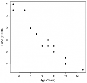
The following table and scatter plot show the relationship between the price (in $1,000) and the age (in years) of 15 used cars of a particular make and model.

Table 13.1: Age and Price of Used Cars

Age (x, in year) Price (y, in $1000)
1 14
1 13
3 13
4 10
4 10
5 9
5 9
6 7
7 7
7 8
8 7
8 6
10 5
10 4
13 3
A scatter plot of Table 13.1, the price versus age of cars. Image description available.
Figure 13.1: Scatter Plot of Price V.S. Age of 15 Used Cars. [Image Description (See Appendix D Figure 13.1)] Click on the image to enlarge it.


Exercise: Can We Use a Simple Linear Regression?

  1. Could we use a straight line to model the relationship between the price and age of the used cars?
  2. How does the price of used cars change when the age increases?
Show/Hide Answer

Answers:

  1. Yes, since the points are roughly on a straight line.
  2. The price of used cars tends to decrease as age increases.

License

Icon for the Creative Commons Attribution-NonCommercial-ShareAlike 4.0 International License

Introduction to Applied Statistics Copyright © 2024 by Wanhua Su is licensed under a Creative Commons Attribution-NonCommercial-ShareAlike 4.0 International License, except where otherwise noted.