1.5 Shape of a Distribution
A histogram shows the shape of the distribution of a quantitative variable. The shape of a distribution includes the following three aspects:
- Overall shape: what the distribution looks like, e.g., bell-shaped, J-shaped, triangular, and uniform. (See examples in the figures below.)
- Modality: number of peaks (highest points). A distribution is called unimodal if it has only one peak, bimodal if it has two peaks, and multimodal if it has more than two peaks.
- Symmetry and skewness. If you fold a distribution in the middle and the two parts can match, the distribution is called symmetric. If it has a longer left tail, it is called skewed to the left (or left skewed), and skewed to the right (or right skewed) if it has a longer right tail.
The following figure shows some special shapes of distributions.
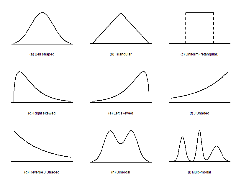
Distributions in Figure 1.8 can be described respectively as follows:
(a) bell-shaped, unimodal, and symmetric
(b) triangular, unimodal, and symmetric
(c) rectangular, no peak, and symmetric
(d) unimodal and right-skewed
(e) unimodal and left-skewed
(f) J-shaped, unimodal, and left skewed
(g) reversed J-shaped, unimodal, and right-skewed
(h) bimodal and symmetric
(i) multimodal and asymmetric
Example: Shape of a Distribution
Comment on the overall shape and modality of the following histogram.
 Figure 1.8.1: The histogram of the grades data above shows its distribution is bell-shaped, unimodal, and symmetric. [Image Description (See Appendix D Figure 1.8.1)]

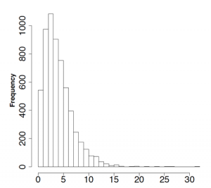
Figure 1.9 is the histogram of survival time in years after cancer diagnosis. Comment on the overall shape and modality of the histogram.
Show/Hide Answer
We can see the distribution of the survival time is unimodal and right-skewed.
