5.6 Assessing Normality: Normal Probability Plot
In later chapters, it will be necessary for us to assume our sample is selected from a normally distributed population; an easy way to check this assumption is to do so via graphical methods. For example, we can construct a histogram of our sampled data and if the histogram looks to be somewhat bell-shaped, then it is reasonable for us to assume the population is normally distributed (or at least approximately normally distributed). However, histograms only tend to inherit features of the population when the sample size is reasonably large.
A more effective alternative to a histogram is a normal probability plot, which plots observed data points against normal quantiles (for this reason, normal probability plots are often referred to as normal Q-Q plots, where “Q” stands for “Quantile.”). If the distribution of the data is roughly normal, the points on a normal probability plot will roughly fall on a straight line. Deviations from a straight line indicate that the underlying distribution is not normal.
Typically, software such as R commander is used to make a normal probability plot. Some software plots the observed quantiles in the y-axis by default (e.g., R), and some plots the normal quantiles in the y-axis (e.g., Minitab). The steps to draw a normal probability plot are illustrated in the following example.
Example: Accessing Normality Using Normal Probability Plot
Suppose the data are: 75, 80, 90, 85, 75, and 40. Check whether the data are from a normal distribution by drawing a normal probability plot.
Steps:
- Sort the data from smallest to largest. We refer to the sorted data as the observed quantiles and put them in the first column of a table.
- Refer to a table of normal scores (such as Table III in the appendix of the course textbook) in order to find the normal quantiles (sometimes called theoretical quantiles). In this example, there are [latex]n=6[/latex] data points and so we copy the column with [latex]n=6[/latex] into the second column of our table.
- Plot the observed quantiles (y-axis) versus the theoretical quantiles (x-axis) or the other way.
- If the data points roughly fall on a straight line, then we assume the data are from a normal distribution; otherwise, the data are not from a normal distribution.
Table 5.2: Observed and Theoretical Quantiles for a Normal Q-Q plot
|
 |
The six points do not fall in a straight line; the data do not seem to come from a normal distribution. However, the point on the lower left corner might be an outlier. If we remove this potential outlier, the other five points roughly fall on a straight line.
Exercise: Normal Probability Plot
Comment on the following normal probability plots and answer whether the data seem to come from a normal distribution.
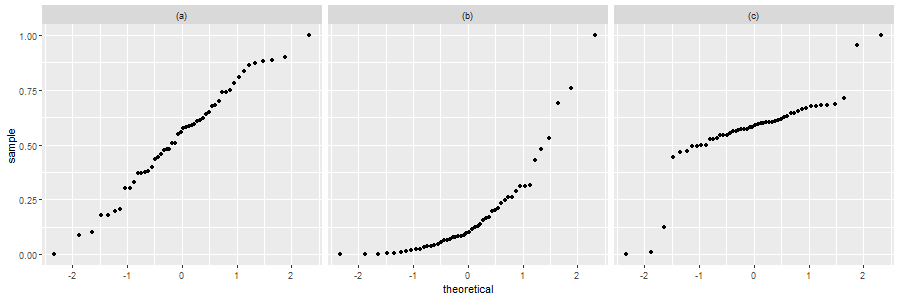
Show/Hide Answer
| The points form an approximate straight line. Thus, it is reasonable to assume the data are from a normal distribution. | The points do not form a straight line (there is obvious curvature). This suggests that the data are not from a normal distribution. | Excluding the outliers, the points form an approximate straight line. Thus, it is reasonable to assume the data are from a normal distribution (if we disregard the outlier). |
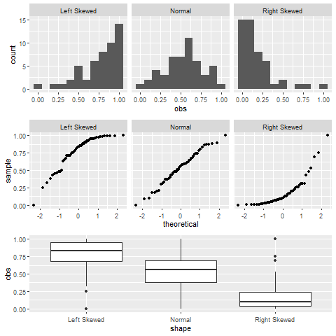
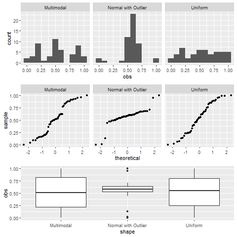
Histogram, boxplot and normal probability (Q-Q) plot are popular graphs used to explore the distribution of data. If the data are taken from a normal population, the histogram should appear to be bell-shaped, the boxplot should be symmetric, the normal probability plot should show a linear pattern. When the number of observations is not large, however, the histogram might not show bell-shape with different bin widths. Note that a boxplot cannot be used to confirm that data follow a normal distribution since some distributions, such as uniform and multimodal, are also symmetric. Therefore, the normal probability plot is the best graphical method to assess normality. Figure 5.12 shows histograms, normal probability plots, and boxplots for six typical distributions: left skewed, normal, right skewed, multimodal and symmetric, normal with outliers, and uniform. Based on the graphs, we can see how histogram features correspond to boxplot and normal probability features.