2.4 Five-Number Summary and Boxplot
The five-number summary of a data set consists of the minimum (the smallest observation), [latex]Q_1, Q_2,Q_3[/latex] and the maximum (the largest observation).
These five numbers together give us a brief idea about the distribution of the data: [latex]Q_2[/latex] (the median) is the centre of the distribution, the range (the difference between the maximum and the minimum) and the IQR (the difference between [latex]Q_3[/latex] and [latex]Q_1[/latex]) tell us the spread (variation) of the data. The difference between [latex]Q_1[/latex] and the minimum, between [latex]Q_2[/latex] and [latex]Q_1[/latex], between [latex]Q_3[/latex] and [latex]Q_2[/latex], and between the maximum and [latex]Q_3[/latex] give the range of the first, second, third and fourth 25% of the data respectively. Moreover, the five-number summary helps us identify outliers, those observations that are far away from the bulk of the data.
2.4.1 Identify Outliers
Outliers are observations far away from the majority of the data. Quantitatively, any observation that falls outside the interval of (lower limit, upper limit) is considered as an outlier. The upper and lower limits are defined as:
[latex]\text{lower limit} = Q_1 - 1.5 \times IQR; \quad \text{upper limit} = Q_3 + 1.5 \times IQR.[/latex]
Example: Identify Outliers
Identify the outliers for the data 3, 1, 9, 7, 5, 11, 21 if any.
Steps:
- Find the quartiles. Refer to Example 4, part (a), [latex]Q_1 = 4, Q_2=7, Q_3=10[/latex].
- [latex]IQR = Q_3 - Q_1 = 10-4=6[/latex]
- [latex]\text{lower limit}=Q_1 -1.5 \times IQR=4-1.5 \times 6=-5[/latex]
- [latex]\text{upper limit}=Q_3+1.5 \times IQR=10+1.5 \times 6=19[/latex]
Since 21 > 19, it is outside the interval (-5, 19), 21 is an outlier.

Exercise: Choose Proper Measures
Based on the histogram and five-number summary of the data, answer the following questions.
Table 2.3: Five-Number Summary of the Data
|
Summary
|
Min
|
Q1
|
Median
|
Q3
|
Max
|
|
|
0.1
|
2
|
3.5
|
5
|
32
|
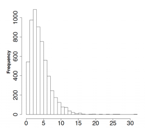
- Comment on the distribution (shape, centre, spread).
- Are there any outliers in the data?
- Provide proper measures of the centre and spread of the data. Explain why.
Show/Hide Answer
- Comment on the distribution (shape, centre, spread).
The distribution is unimodal, skewed to the right with a median 3.5 and [latex]IQR = 5-2=3[/latex].
- Are there any outliers in the data?
Yes. [latex]\text{Upper limit} = Q_3 + 1.5 \times IQR = 5 + 1.5 \times 3 = 9.5[/latex].
Any observation greater than 9.5 is an outlier.
- Provide proper measures of the centre and spread of the data. Explain why.
Use median for the centre and IQR for the spread due to outliers and strong skewness.
2.4.2 Boxplot
A boxplot, also called a box-and-whisker plot, is a useful tool to display the centre and spread of a data set by providing a graphical representation of the five-number summary as well as potential outliers. Steps to draw a boxplot:
- Calculate the five-number summary: minimum, [latex]Q_1, Q_2, Q_3[/latex], and maximum.
- Calculate the lower and upper limits: [latex]\text{lower limit}=Q_1 -1.5 \times IQR[/latex], and [latex]\text{upper limit} = Q_3 + 1.5 \times IQR.[/latex]
- Find the adjacent values, the largest and smallest observations within the lower and upper limits. Identify the potential outliers (observations beyond the upper and lower limits), if any exist.
- Draw short horizontal lines at [latex]Q_1, Q_2, Q_3[/latex] , and connect them with vertical lines to form a box.
- Draw very short horizontal lines at the adjacent values and then draw the whiskers by connecting the adjacent values and the box with vertical lines.
- Plot each potential outlier with an asterisk.
- Put labels and the title.

- A boxplot can be drawn vertically or horizontally.
- Symbols such as circles or asterisks are often used to plot potential outliers.
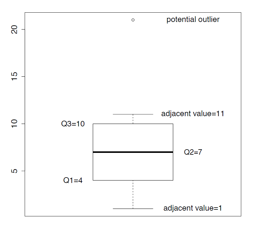
Example: Draw a Boxplot
Construct a boxplot for the data 3, 1, 9, 7, 5, 11, 21.
Steps:
- Calculate the five-number summary:
sort: 1, 3, 5, 7, 9, 11, 21
[latex]min = 1, Q_1=4, Q_2=7, Q_3=10, max = 21[/latex] - Calculate the lower and upper limits
[latex]IQR = Q_3 - Q_1 = 10 - 4 =6[/latex]
[latex]\text{lower limit} = Q_1 -1.5 \times IQR = 4 - 1.5 \times 6 = -5[/latex]
[latex]\text{upper limit} = Q_3 +1.5 \times IQR = 10 + 1.5 \times 6 = 19.[/latex] - Adjacent values are 1 and 11, so the max 21 is an outlier.
- Form a box based on [latex]Q_1 = 4, Q_2 = 7, Q_3 = 10.[/latex]
- Mark the adjacent values 1 and 11, “grow the whiskers,” the dashed lines connecting the box and the adjacent values.
- Plot the potential outlier with 21.
- Title and label the boxplot.
We can describe the distribution of the data in the following aspects based on a boxplot:
- The centre: the median [latex]Q_2[/latex].
- The spread (variation): the range and IQR. Note that, however, the range is sensitive to outliers.
- The shape of the distribution:
- Left skewed if the distance between the lower adjacent value and [latex]Q_1[/latex] is larger than the distance between the upper adjacent value and [latex]Q_3[/latex], and the distance between [latex]Q_1[/latex] and the median is larger than the distance between [latex]Q_3[/latex] and the median.
- Right skewed if the distance between the lower adjacent value and [latex]Q_1[/latex] is smaller than the distance between the upper adjacent value and [latex]Q_3[/latex], and the distance between [latex]Q_1[/latex] and the median is smaller than the distance between [latex]Q_3[/latex] and the median.
- Symmetry if the distance between the lower adjacent value and [latex]Q_1[/latex] is approximately equal to the distance between the upper adjacent value and [latex]Q_3[/latex], and the distance between [latex]Q_1[/latex] and the median is approximately equal to the distance between [latex]Q_3[/latex] and the median.
- Note that it is sometimes the case that the whiskers show skewness in one direction while the box shows skewness in the opposite direction. In such cases, it is not always possible to clearly determine skewness or symmetry.
- Identify outliers.
The following are three boxplots that show right skewed, symmetric, and left skewed distributions respectively.
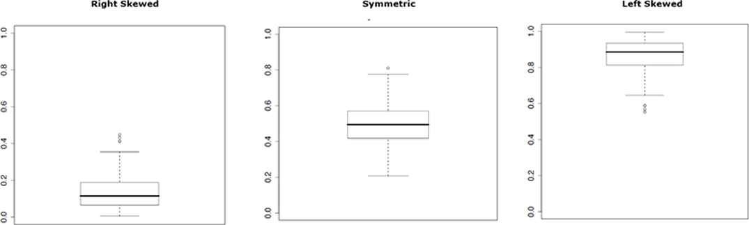
Figure 2.4: Boxplots of Skewed and Symmetric Distributions. [Image Description (See Appendix D Figure 2.4)]
Similar to side-by-side histograms, we can use side-by-side boxplots to compare different groups.
Example: Side-by-Side Boxplots
I want to compare grades of students who attend lectures with those who do not. Both the table and the side-by-side boxplots tell us that:
- Attendees have a larger median score.
- Non-attendees have a slightly larger variation. Both the IQR (height of the box) and standard deviation of non-attendees are larger than that of attendees.
- Grades of both groups are slightly left skewed with a longer tail on the lower end.
Table 2.4: Numerical Summaries of Grades of Non-Attendees and Attendees
| Summary | Min | Q1 | Median | Q3 | Max | Mean | SD |
|---|---|---|---|---|---|---|---|
| Non-attendees | 35.62 | 52.70 | 64.76 | 77.78 | 87.30 | 63.23 | 15.48 |
| Attendees | 47.77 | 69.80 | 77.83 | 85.15 | 96.51 | 76.92 | 11.83 |
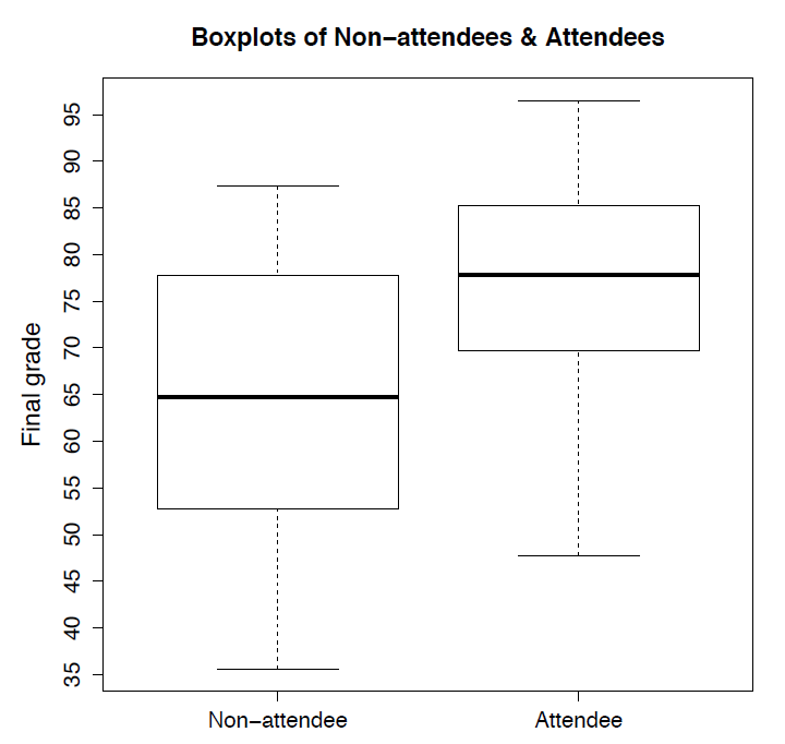
Figure 2.5: Side-by-Side Boxplots of Non-Attendees and Attendees. [Image Description (See Appendix D Figure 2.5)]
Exercise: Draw a Boxplot
Draw a boxplot for the data: -5, 0.05, 0.15, 0.25, 0.35, 0.45, 0.55, 0.65, 0.75, 0.85, 0.95.
Show/Hide Answer
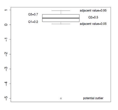
Steps:
- Calculate five-number summary:
sort: -5, 0.05, 0.15, 0.25, 0.35, 0.45, 0.55, 0.65, 0.75, 0.85, 0.95
[latex]min=-5, Q_1=0.2, Q_2=0.45, Q_3=0.7, max=0.95[/latex] - Calculate the lower and upper limits
[latex]IQR=Q_3-Q_1=0.7-0.2=0.5[/latex]
[latex]\text{lower limit} =Q_1-1.5 \times IQR=0.2-1.5 \times 0.5=-0.55[/latex]
[latex]\text{upper limit}=Q_3+1.5 \times IQR=0.7+1.5 \times 0.5=1.45[/latex] - Adjacent values are 0.05 and 0.95, the min -5 is an outlier.
- Form a box based on [latex]Q_1=0.2,Q_2=0.45,Q_3=0.7.[/latex]
- Mark the adjacent values 0.05 and 0.95, and then draw the whiskers, the dashed lines connecting the box and the two adjacent values.
- Plot the outlier -5.
- Title and label boxplot.
